
How to pair fonts for print
Typography is an art and has been since the first cave drawings millions of years ago. The art, the science and the communication via type is one of the most important factors to graphic design; signage, books, newspapers adverts and articles, publications, corporate stationery, and to the most recent source, websites. For many, a font can look similar to another and in all fairness if you haven't got a design discipline or interest in fonts then you wouldn't notice the slight differences; Script, display, slab serif, hand drawn, retro, dingbat (remember windings?) monospaced, novelty, comic, stencil, blackletter, calligraphic, typewriter, pixel, grunge - which narrow down to; Serif, San Serif and Script
Long gone are the days where Times New Roman and Comic Sans were paired together. In actual fact, there are numerous anti 'Comic Sans' websites which traumatised Graphic Designers to the core. Comic Sans were often used by teachers in school. Although a common font for Microsoft Word, it is big NO for many because of its boldness, childish and too informal. Times New Roman was the professional font to use for formal letters and then there was Arial. The top three for Microsoft.
There are hundreds of fonts available, some of them free and others paid for. Choosing the right font will frame the way your brand communicates visually so it is important to spend the time to find the right one or two fonts that work well together.
Tips to find the right font;
- Established a visual hierarchy
- Think about opposites attract such as bold and light or large and small.
- Work with the same type family, using two different weights and size. Generally, titles are bold and the body text is a light weight. The same applies to Serif and Sans Serif.
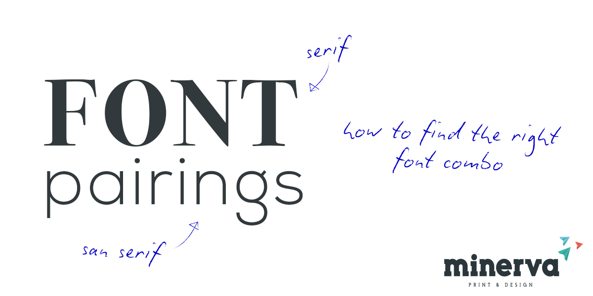
- Combine Serif fonts with Sans Serif Fonts
- Do not combine similar fonts
- Use script type as a title and not body text as this is harder to read.
- Lowercase and uppercase
Find a font that suits your theme or mood. eg
- script - romance, feminine, high-end boutique,
- thin serif - modern, high fashion brands,
- bold san serif - masculine, casual and modern,
- handwriting - personal, carefree, casual, serif, classic, fashionable, high end
- typewriter - classic, vintage, organic
- retro - vintage, retro, kitsch
Our favourite font pairings can be seen below.
