
Proofing your Artwork
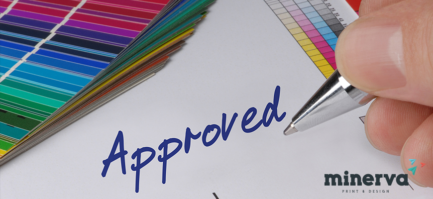
We never print any artwork without you approving the print first. The proof allows our clients view the design to double check areas where objects could be cut off such as text or logos.
When using lighter shades, avoid tints that contain less than 10% of either Cyan, Magenta, Yellow or Black, as they usually print much lighter than they appear on screen and you may be disappointed with the outcome. For best results, use tints containing 15% to 30% where possible. When you submit artwork, you should outline any specific Pantone colours and we will show you a swatch chart to ensure correct matching. The colours in these charts will give you the closest approximation to how your finished job will look, and with any print, there may be a slight colour variation.
Try to avoid large areas of the same colour, as this is where the variation becomes more noticeable. Adding a texture or images can allow you to overcome these issues. Vignettes and gradient fills are best avoided and look unprofessional, as often these will show banding.
As part of the service we will supply you with a colour proof. This is not colour accurate and is produced on a laser printer. The proof acts as a guide to show how the finished print will look and should be used to check that the text hasn’t overflowed and no objects are missing.
Our proofs cannot be relied upon to spot items such as objects set to overprint, hairlines and JPEGs/RGB/ Duotone images. If you need more accurate proofs then just ask our team. You will get the best reproduction from colours that are made up from one or two inks.